|
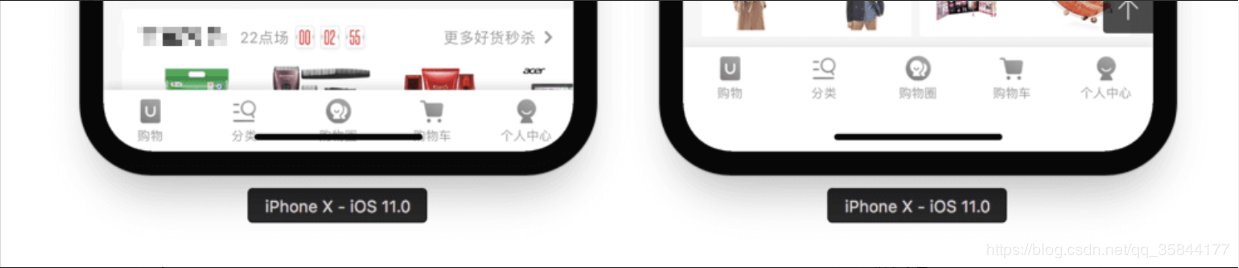
��(d��o)�x��С�����m��iPhone X��Ҫᘌ�(du��)fix��λ���ײ��ą^(q��)����Ԕ��퓻�ُ��܇�ײ��İ��o�ڣ���(hu��)�ciPhone X��Home Indicator�M�l�دB���@�����c(di��n)���·����o�r(sh��)�������`�|�l(f��)�ք�(sh��)��������... ��С�����m��iPhone X��Ҫᘌ�(du��)fix��λ���ײ��ą^(q��)����Ԕ��퓻�ُ��܇�ײ��İ��o�ڣ���(hu��)�ciPhone X��
�f���� 1. �@ȡ�O(sh��)����Ϣ
/**
* �@ȡ�O(sh��)����Ϣ
* @returns {Promise<any>}
*/
export function wechatGetSystemInfo () {
return new Promise((resolve, reject) => {
wx.getSystemInfo({
success: (res) => {
resolve(res)
}, fail: (err) => {
reject(err)
}
})
})
}
2. �O(sh��)��css��ʽ
.view-fix-iphonex {
 bottom: ~'68rpx' !important;
}

.view-fix-iphonex::after {
 content: ' ';
 position: fixed;
 bottom: 0 !important;
 height: ~'68rpx' !important;
 width: 100%;
 background: #fff;
}
3. �O(sh��)��һ��(g��)��(bi��o)�R(sh��)�� ��
<script>
import wx from 'wx'
import { mapGetters, mapActions } from 'vuex'
import { wechatGetSystemInfo } from './utils/weappUtils'
export default {
onLaunch () {
this.isIphoneX()
},
computed: {
...mapGetters(['isIpx'])
},
methods: {
//�Д��O(sh��)���Ƿ���iphoneX
isIphoneX() {
wechatGetSystemInfo().then(res => {
const deviceModel = 'iPhone X'
let isIpx = false
if (res.model.indexOf(deviceModel) > -1) {
isIpx = true
}
if (this.isIpx !== isIpx) {
this.setIsIpx(isIpx)
}
}).catch(err => {})
},
...mapActions(['setIsIpx'])
}
}
</script>
4. ����Ҫ�m���������O(sh��)�� ����
<template>
<div class="fix-view"
:class="isIpx?'view-fix-iphonex':''"
>
�����ڵײ��ą^(q��)��
</div>
</template>
<script>
import wx from 'wx'
import {mapGetters} from 'vuex'
export default {
computed: {
...mapGetters(['isIpx'])
},
}
</script>
<style lang="less">
.fix-view {
position: fixed;
left: 0;
right: 0;
bottom: 0;
height: ~'100rpx';
line-height: ~'100rpx';
box-sizing: border-box;
text-align: right;
display: flex;
justify-content: end;
background: #fff;
}
</style>
�·��� env() �� constant() iOS11 �������ԣ�Webkit ��һ��(g��) CSS ����(sh��)�������O(sh��)����ȫ�^(q��)���c߅��ľ��x�����Ă�(g��)�A(y��)���x��׃����
�@���҂�ֻ��Ҫ�P(gu��n)ע safe-area-inset-bottom �@��(g��)׃������?y��n)����?du��)��(y��ng)�ľ���С�ڗl�ĸ߶ȣ��M�Q��?x��)rֵ��һ�ӣ���
���@֮ǰ���P��ʹ�õ��� constant()��������ٷ��ęn�����@ôһ��עጣ��ӣ���
�@����ζ����֮ǰʹ�õ� constant() �� iOS11.2 ֮��Ͳ���ʹ�õģ����҂�߀����Ҫ�������ݣ����@�ӣ� padding-bottom: constant(safe-area-inset-bottom); /* ���� iOS < 11.2 */ padding-bottom: env(safe-area-inset-bottom); /* ���� iOS >= 11.2 */ ע�⣺env() �� constant() ��Ҫͬ�r(sh��)���ڣ���������ܓQ�� ��Ԕ��(x��)�f���������ęn��Designing Websites for iPhone X ����m�� �˽����������f�Ďׂ�(g��)֪�R(sh��)�c(di��n)�������҂��m���˼·�ͺ������ˡ� ��һ�����O(sh��)�þW(w��ng)��ڿ�ҕ���ڵIJ��ַ�ʽ ���� viweport-fit ���ԣ�ʹ������(n��i)����ȫ���w����(g��)���ڣ� <meta name="viewport" content="width=device-width, viewport-fit=cover"> ǰ��Ҳ���ᵽ�^��ֻ���O(sh��)���� viewport-fit=cover������ʹ�� env()�� �ڶ�����������w��(n��i)�����ڰ�ȫ�^(q��)���(n��i) �@һ������(j��)��(sh��)�H����(ch��ng)���x��������O(sh��)���@��(g��)ֵ�����ܴ���С�ڗl�ړ������ײ�?j��)?n��i)�ݵ���r��
body {
	padding-bottom: constant(safe-area-inset-bottom);
  padding-bottom: env(safe-area-inset-bottom);
}
��������fixed Ԫ�ص��m�����һ��fixed ��ȫ����Ԫ�أ�bottom = 0���������D�@�ɷN��r��
����ͨ�^�Ӄ�(n��i)߅�� padding �U(ku��)չ�߶ȣ�
{
	padding-bottom: constant(safe-area-inset-bottom);
  padding-bottom: env(safe-area-inset-bottom);
}
����ͨ�^Ӌ(j��)�㺯��(sh��) calc ���wԭ���߶ȣ�
{
height: calc(60px(���O(sh��)ֵ) + constant(safe-area-inset-bottom));
height: calc(60px(���O(sh��)ֵ) + env(safe-area-inset-bottom));
}
ע�⣬�@��(g��)������Ҫ���חl������б���ɫ�ģ���?y��n)�U(ku��)չ�IJ��ֱ����Ǹ��S�������ģ���t���F(xi��n)�U����r�� ߀��һ�N�������ǣ�����ͨ�^����һ��(g��)�µ�Ԫ�أ��յ��ɫ�K����Ҫ����С�ڗl�߶ȵ�ռλ����Ȼ������Ԫ�ؿ��Բ���׃�߶�ֻ��Ҫ�{(di��o)��λ�ã����@�ӣ�
{
	margin-bottom: constant(safe-area-inset-bottom);
  margin-bottom: env(safe-area-inset-bottom);
}
�յ��ɫ�K��
{
	position: fixed;
  bottom: 0;
  width: 100%;
  height: constant(safe-area-inset-bottom);
  height: env(safe-area-inset-bottom);
  background-color: #fff;
}
��Ͷ���fixed ����ȫ����Ԫ�أ�bottom �� 0�������� ������픲���������(c��)߅�V�桱 �� ���@�Nֻ��λ����Ҫ��(du��)��(y��ng)�����{(di��o)�������ԃHͨ�^��߅�� margin ��̎����
{
	margin-bottom: constant(safe-area-inset-bottom);
  margin-bottom: env(safe-area-inset-bottom);
}
���ߣ���Ҳ����ͨ�^Ӌ(j��)�㺯��(sh��) calc ���wԭ�� bottom ֵ��
{
bottom: calc(50px(���O(sh��)ֵ) + constant(safe-area-inset-bottom));
bottom: calc(50px(���O(sh��)ֵ) + env(safe-area-inset-bottom));
}
��Ҳ����ʹ�� @supports ���x���ݘ�ʽ �����@��҂���Ҋ�ăɷN��͵� fixed Ԫ���m�䷽���ѽ�(j��ng)�˽��˰ɡ�����҂�ֻϣ�� iPhoneX ����Ҫ�����m���ʽ���҂�������� @supports �����x���ݘ�ʽ����(d��ng)Ȼ�@��(g��)̎�팦(du��)���չʾ��(sh��)�H����(hu��)���κ�Ӱ푣�
@supports (bottom: constant(safe-area-inset-bottom)) or (bottom: env(safe-area-inset-bottom)) {
	div {
  	margin-bottom: constant(safe-area-inset-bottom);
    margin-bottom: env(safe-area-inset-bottom);
  }
}
�����@ƪ�P(gu��n)����С�������ׅ^(q��)���m��iPhoneX�Č�(sh��)�F(xi��n)�����¾ͽ�B���@��,�������P(gu��n)С�������ׅ^(q��)���m��iPhoneX��(n��i)��Ո(q��ng)������վ��ǰ�����»��^�m(x��)�g�[��������P(gu��n)����ϣ������Ժ���֧�ֱ�վ��
�����ܸ��dȤ������:
|
��ܰ��ʾ��ϲ�g��վ��Ԓ��Ո(q��ng)�ղ�һ�±�վ��
��վ�l(f��)����Win7������ϵ�y(t��ng)��Win10�������XP������ϵ�y(t��ng)�H�邀(g��)�ˌW(xu��)��(x��)�y(c��)ԇʹ�ã�Ո(q��ng)?ji��n)����d��24С�r(sh��)��(n��i)�h�������������κ��̘I(y��)��;����t�����ؓ(f��)��Ո(q��ng)֧��ُ�Iܛ����ܛ����
��վ�����YԴȫ�������ھW(w��ng)�j(lu��)�YԴ,���ַ������ę�(qu��n)��,Ո(q��ng)���r(sh��)֪ͨ�҂�(peng896066052@126.com),�҂���(hu��)���r(sh��)̎��.
Copyright © 2018-2020 ����ľ�L(f��ng)���dվ